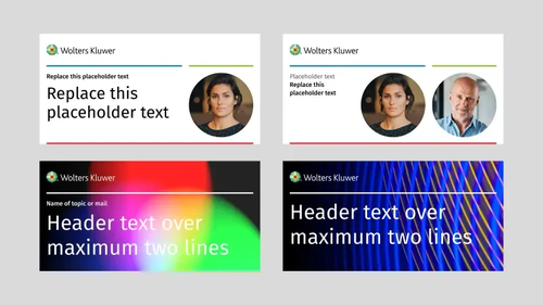
WK backgrounds v170620 9

Our brand. One place. Ready to use.

Welcome to Wolters Kluwer

Wolters Kluwer. When you have to be right

Every day, professionals face moments that define outcomes. A diagnosis. A legal ruling. A financial risk. These are more than tasks. They are turning points that carry weight for people, businesses, and society.

We are not only building expert solutions. We are helping professionals deliver impact with confidence, progress their industries, and shape the future.

Purpose

We deliver deep impact when it matters most. Our purpose drives how we innovate, how we collaborate, and how we measure success.

Vision

A world where professionals have the clarity, tools, and confidence to shape a better future.

Mission

We help professionals deliver impact by combining expert knowledge with advanced, human-centered technology.

  • 01Drive customer value

  • 02Progress our world

  • 03Shape the future

Expert AI

Aircraft engineers discussing on jet engine in aircraft maintenance factory

Wolters Kluwer Expert AI marks a pivotal moment in our transformation journey. AI is no longer a dot on the horizon: it's an evolutional steppingstone, and it’s here to stay.

About the Expert AI campaign

The industry is increasingly adopting and leveraging single branded names for AI in-product features, driving strong visibility and customer awareness.

About the Expert AI campaign

Through the campaign we activate our storytelling around Wolters Kluwer Expert AI backed by consistent messaging and substantiated proof points.

About the Expert AI campaign

The Wolters Kluwer Expert AI campaign is a controlled campaign at master brand level.

A panoramic view of the nanjing city skyline

Stacey Caywood

The combination of superior data and human expertise protects and strengthens our revenue model, which is evidenced by the increasing demand for our products. 

People of Progress

Introducing the Wolters Kluwer Master brand credentials campaign

People of Progress

When businesses choose Wolters Kluwer, whether for our expert solutions, the power of AI, or services we offer, their decision is influenced by more than product specs.

People of Progress

They choose Wolters Kluwer for our expertise, reliability, credibility, long-term trust, innovation, and our ability to adapt.

People of Progress

That is why we have launched a master brand credentials campaign – an initiative designed to reinforce our brand’s authority, build familiarity, and drive long-term growth.

260305 WK Po P New KV March AI

The People of Progress campaign visually and verbally embodies our brand purpose of helping professionals deliver deep impact where it matters most. This concept celebrates both our employees and customers as forward-thinkers united by curiosity, agility and perseverance — qualities that transform obstacles into opportunities.​

Brand Identity

Ey Jw YX Ro Ijoid29sd G Vycy1rb HV3 ZX Jc L2 Zpb G Vc L1 BKU0 M0 S0 My Sl Z Ncl V Wa W1 ERG1l Lmpw Zy J9 wolters kluwer A Hpyi OH Zl FTN3869 Dubp8w M Wu T Fp E Ms UK2p DH0 EX Nc

Design that drives us forward

Our brand is designed to help you create, not hold you back. We’ve simplified our guidelines so anyone, in any role, can produce on-brand work that’s clear, consistent, and impactful.

You don’t need to be a designer. You just need the right tools, a little guidance, and the confidence to get started.

Our Logo

Ey Jw YX Ro Ijoid29sd G Vycy1rb HV3 ZX Jc L2 Zpb G Vc L0 Zu Q0 Rxcm1 Fd1 R3d F Vu MXU0 Sl NN Ln Bu Zy J9 wolters kluwer K5c17e3 Vl6 Jus Fl M8 scpo75f XI Pl ALL Mnz Zt E3 E Bvg

Our logo was created in 2005, marking the start of our journey as a software company. It stands for a company that is constantly on the move. The red square in our logo symbolizes how we anticipate the needs and aspirations of our customers, who are always at the core of our thinking.

Ey Jw YX Ro Ijoid29sd G Vycy1rb HV3 ZX Jc L2 Zpb G Vc L05 KU3 Ja RE Ro Yj E2c X Ez Q3lkbn Iz Ln Bu Zy J9 wolters kluwer vzno E05wn Ybpg Cyfr Vh I0 Gxts W2 R Bd WA Wwvy V Fn Pj JM

The squares inside the wheel align to a 5x5 pixel grid with the red square in the middle of the circle.

Ey Jw YX Ro Ijoid29sd G Vycy1rb HV3 ZX Jc L2 Zpb G Vc L0 Nk Ullq Q012 O Gtxa W9 WN1oza T Fm Ln Bu Zy J9 wolters kluwer CU75ly On4i Cj WJ25 Agc Eq9j Yijh uy f9m22 Y7xbg
Ey Jw YX Ro Ijoid29sd G Vycy1rb HV3 ZX Jc L2 Zpb G Vc Lz U3 V Etld Th Fajl BN Wt HY3 Vr WEVS Ln Bu Zy J9 wolters kluwer RWKR9 Mr DY Hj V Ox43a0 Ka NO7pk F Phkxd GGT Cr FH5 F Bs

Logo lockup

The logo lockup is a simple yet elegant solution for showing a suite or product module as primary communicator. It builds upon our brand's foundational elements and avoids the master brand and product brands to compete. It's compact, simple, and flexible.


How we use
Typography
Typography
Typography

Fira Sans is our typeface. It is a humanistic sans-serif font family that was co-created by a group of renowned type designers including digital font expert and designer Erik Spiekermann. It is designed for the digital era, yet also suitable for print.

Fira Sans Light

Weight 300

Fira Sans Regular

Weight 400

Fira Sans Medium

Weight 500

Fira Sans Bold

Weight 700

Fira Sans Bold

W

Fira Sans Light

K

Fira Sans Medium

@

Fira Sans Regular

&

100% Lineheight

-2 Tracking

Promote Sustainability

Typography has been a fundamental medium for sharing knowledge for centuries, and it still is today. Whether in print or on screen, good typography is legible and pleasant to the eye. Our typographical tools and principles have been developed to meet these requirements, regardless of medium or device, and support a broad range of languages.

How we use

Color

Primary Colors

Red 500#e5202e

Green 500#85bc20

Blue 500#007ac3

Reds

Red 25#fef4f5

Red 50#fce9ea

Red 100#fad2d5

Red 175#f6b1b6

Red 250#f29097

Red 375#ec5862

Red 500#e5202e

Red 525#da1e2c

Red 575#c31b27

Red 625#ac1823

Red 675#95151e

Red 750#721017

Red 825#500b10

Greens

Green 25#f9fcf4

Green 50#f3f8e9

Green 100#e7f2d2

Green 175#d4e8b1

Green 250#c2de90

Green 375#a4cd58

Green 500#85bc20

Green 525#7eb31e

Green 575#71a01b

Green 625#648d18

Green 675#567a15

Green 750#425e10

Green 825#2f420b

Blues

Blue 25#f2f8fc

Blue 50#e6f2f9

Blue 100#cce4f3

Blue 175#a6d1ea

Blue 250#80bde1

Blue 375#409bd2

Blue 500#007ac3

Blue 525#0074b9

Blue 575#0068a6

Blue 625#005b92

Blue 675#004f7f

Blue 750#003d61

Blue 825#002b44

Neutral Colors

Black#000000

White#ffffff

Red, green, and blue represent our digital focus, the essential quality of our products and solutions, and the simplicity of how we deliver information. Together with black and white, we use these colors to bring our messages to life.

Color tints and shades have a functional purpose in our color scheme. Tints and shades are helpful in user-interfaces in digital products and in visualizing complex data.

Tints are created by adding white to our base colors whereas shades are created by adding black to our base colors. In our latest color palette we have 6 of each.

Icons

Dark mode

Light mode

Blue 500

Icons are powerful visual tools that communicate information quickly and effectively, enhancing the usability and visual appeal of our brand communications. 

These guidelines provide direction on selecting, creating, and using icons to maintain consistency and coherence in our brand imagery.

Illustrations

Ey Jw YX Ro Ijoid29sd G Vycy1rb HV3 ZX Jc L2 Zpb G Vc L3l Han R Ie Ex Ne Epp N Fd Lek R0 NG Rt Ln Bu Zy J9 wolters kluwer S Me Y Ydp Ui5 R7r Gvadl UOT pk W Kd9 Wyo TE Xtx WDJ0 Ps Q

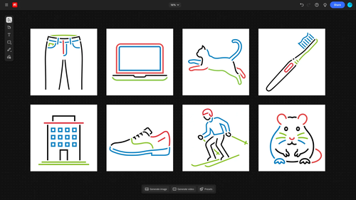
Our visual DNA is embedded in how we create illustrations. We use clean lines in our primary brand colors and black or white. Together, they create bright and playful compositions. The simplicity of our illustrations shows our ability to make complex information usable and consumable. Our illustrations have a light and open style, signaling that we are open minded and that we travel light.
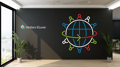
Use our custom Adobe Firefly model to create primary illustrations in the Wolters Kluwer illustration style. This page explains how to request access, generate illustrations, review them against our brand standards, and convert the final result to vector so it can be used in production design work.
Ey Jw YX Ro Ijoid29sd G Vycy1rb HV3 ZX Jc L2 Zpb G Vc Lz Joc Xp Q Ml F Xclhq S Ex T Vk Rq Sld Z Ln Bu Zy J9 wolters kluwer a jp0slom O z Acl kn C Pg MOR4u0 WL8gp1 YV1 PB8aa I

Brand Beats

Brand Beats: Learn, share & reapply is a practical webinar series where colleagues across Branding, Communications, and Marketing share real examples of how they bring our brand to life. 

Each session highlights what’s working in practice so others can learn from it, adapt it, and apply it in their own teams. 

Duis mollis, est non commodo luctus, nisi erat porttitor ligula, eget lacinia odio sem nec elit. Morbi leo risus, porta ac consectetur ac, vestibulum at eros.

Brand blog

Learn more about how our brand works on the Wolters Kluwer Brand Blog.

Asset Creator

Our asset creator helps you produce professional, on-brand materials quickly and confidently — even when design support isn't available. Every template includes a short instruction guide to help you get started.


Before creating your asset, take a moment to consider where and how it will be used. Templates are available in a range of formats and dimensions, optimized for specific social media platforms or aligned with the requirements of our print production partners.

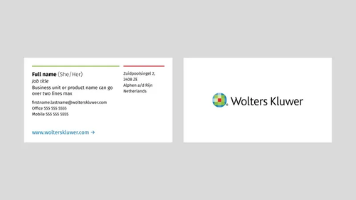
  • 01Logo Lockup

    Logo Lockup
  • 02Business Cards

    Business Cards
  • 03E-Mail Header

    Email Header
  • 04Teams Backgrounds

    Teams Backgrounds
Logo Lockup
Business Cards
Email Header
Teams Backgrounds
Ey Jw YX Ro Ijoid29sd G Vycy1rb HV3 ZX Jc L2 Zpb G Vc L1h N Zk FS Rml TQ1p4 Zz N1 Ujl YW Xl D Ln Bu Zy J9 wolters kluwer J4 Tli S Jg I2 RM Tsp WZC Zzt Gb Wj Dpln I6op Pq68 T Wc ZHE

Inspiration Gallery

The curated gallery shows a selection of design work created by various teams across the organization. It should give you a good overview of how to best apply our design basics, such as colors and typography, to create beautiful on-brand materials.